Design and Development in the Bi-State Reinvestment Corridor of Kansas City
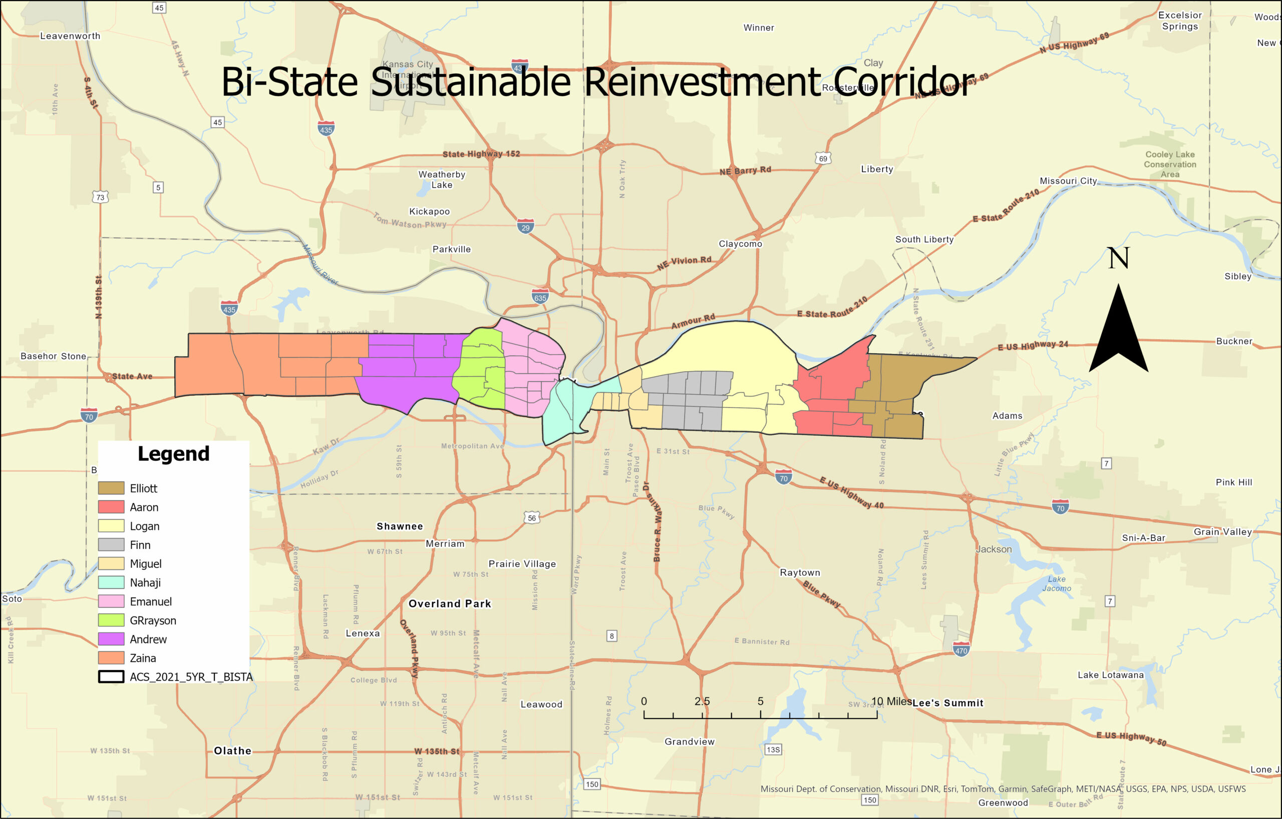
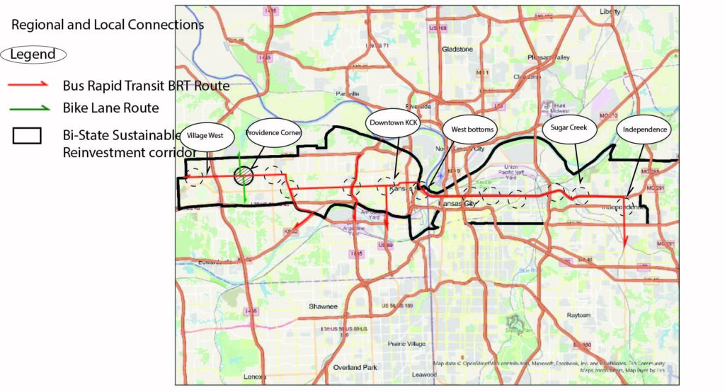
This semester UP+D Studio 312 will be examining the Bi-State Sustainable Reinvestment Corridor of Kansas City, This corridor will combine net-zero electric transit with strategic investments to address environmental justice and economic development.
Improving the corridor requires thinking about some major urban issues of the present time. First, How did the big issues of urban change such as redlining, urban renewal, deindustrialization, and highway construction impact the corridor? Then, what are the existing plans for the corridor? How will we address the issue of housing affordability? Housing costs have been rising 3X faster then income in greater Kansas City. What assets do neighborhoods bring to the bi-state corridor plan? What are the present environmental conditions on the corridor and are their environmental justice hotspots? UMKC might best thought of as a “school zone” and a reduced speed on at least Rockhill and Oak Street might greatly improve safety. How will bicycle facilities and trails cross the corridor and connect to improved transit?
We will conduct this study in four parts – We will start with an Existing Conditions Analysis examining economic, transport, social and demographic trends impacting the neighborhoods and areas around corridor; then conduct a detailed analysis of site conditions and on-the-ground impressions of the corridor, identify strategic nodes for student intervention proposals, followed by the development of final design proposal for catalytic “transit-oriented development” that will advance Independence, and both Kansas City, Missouri and Kansas City, Kansas.
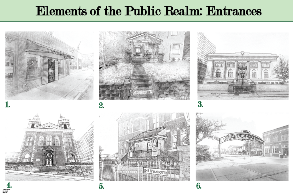
The process of entering and exiting a building is typically a thoughtless procedure. It is also a common procedure. Most times, daily life requires the entering of buildings for work, errands, recreation, and business; sometimes all in one day. As common as this process is, the impacts of building entrances and its relationship to the public realm are not typically acknowledged by those who shape our communities. This may be an issue if the relationship between entrances and the public realm are as intertwined as architecture and urban spatial analysis suggests.
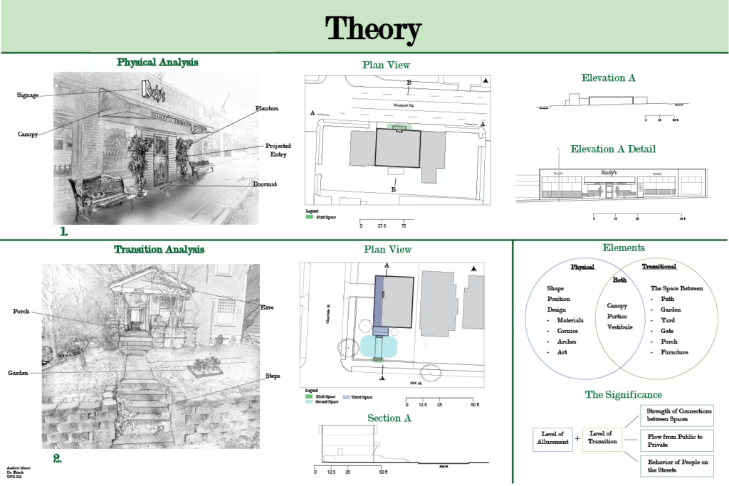
Building entrances are diverse. They may be small, and close to the street such as the entrance to the local Rudy’s Taqueria, or they may be grand, and further away from the street, such as the historic Financial Holding Corporation in downtown Kansas City, Mo.
When analyzing entrances, we can observe two distinct elements that determine the relationship that they have to the public realm: Physical, and Transitional. Physical elements can be observed in the architectural design of the entrance. Architectural qualities include the the position of the entrance relative to the building, overall shape of the entrance, materials used, or specific traits, such as the inclusion of a cornice. The design of the entrance can have important implications for the average man who may be walking along the street. Does the design of the entrance easily identify itself as an entrance? This is one of the most important questions designers may ask themselves when designing an entrance. If the man cannot easily recognize the entrance, then what is the threshold of time before he gives up? Likely, it depends on the individual. Regardless, the design of an entrance has important implications about its recognizability and accessibility.
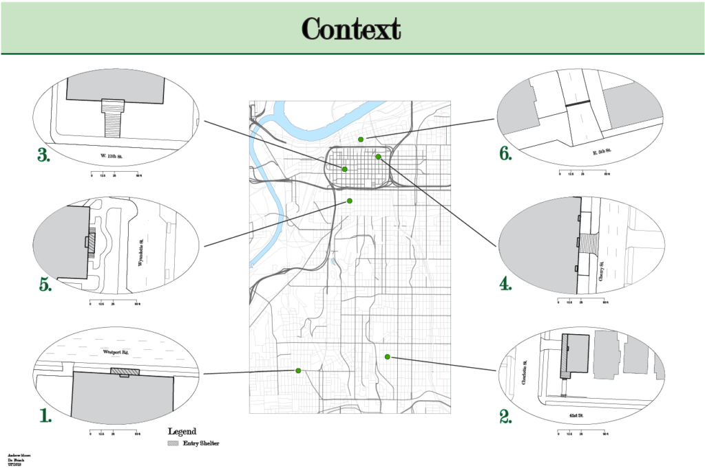
In order to fully understand the relationship between the public realm however, we also need to understand the second element of entrances: Transition. Rather than the physical entrance itself, this refers to the space between the entrance and the street, or the transitional space. The transitional space can vary drastically between buildings as displayed in the last “Theory” board, with the observation of Rudy’s Taqueria, and a residential single family house. Rudy’s has one identifiable space between the street and the entrance, whereas the house has three. The house has three spaces beginning with the initial stairs from the sidewalk to the path, then the path to the porch, and finally ends with the porch to the front door. Transitional elements of entrances may also include private gates or fences, outdoor furniture, a garden, or any other element that represents a space between the street and the front door. To summarize, the transitional aspect of entrances can be observed by the total amount of observable spaces before an entrance, as well as the content within each space that is present.
Transitional and Physical elements are not mutually exclusive. For example, overlap between the two can be seen with the inclusion of a canopy or a portico. Both are a physical dimension of the architectural design, while simultaneously create a transition space before the front door of the building.
The common quality that both elements have lies in their power to control the flow between spaces in the community. This is primarily what establishes the relationship between entrances and the public realm. The impact of controlling this flow can depend on whether one is analyzing in a residential or a commercial context.
Commercially, utilizing transitional aspects to create a space for the entrance when there wasn’t one before may encourage increased pedestrian presence. Examples of potential transitional aspects here could be a canopy above the door to provide shade, or outdoor furniture near the entrance. Combined with the utilization of the other physical architectural elements, a store owner may benefit from increased recognition, accessibility, perceived significance, and placemaking. Applied on a community scale, the difference between commercial spaces and their entrances can directly contribute to the flow between private and public spaces, due to the influence that they have on pedestrian and commuter traffic. If this is true, then what impact could entrances have on the community’s economic state? What could the impact be on the community’s social dynamic? The impact is likely significant.
Equally as important is the impact in a residential context. The transitional element may be most important here during the discussion of the of the public realm, since the homeowner or apartment dweller’s flow from private to public isn’t determined by the architectural details of his residence. In fact, the quantity of the flow here, unlike in a commercial context, is not as significant as the quality of flow. This is mostly determined by transitional elements. How is the transition from residential to public space be determined? The transition should be crafted through a balancing act. Generally speaking, people want to retain a feeling of home in their residence. Simultaneously, they want to retain some connection to the community. If there is too much transition space, the resident risks feeling isolated. If there is too little, the resident risks an abrupt transition that negatively effects his association with home.
This is the art and science of building entrances. Their psychological impacts on the individual eventually manifests into sociological impacts onto the community. They control the flow from public to private and can therefore influence economic and social states. In a neighborhood, they can influence the transition between public to residential, impacting the psychology of the individual, and also the greater connection that the individual has to his neighborhood. With such impactful effects, entrances remain a key element to the public realm. If our society continues to investigate additional elements of the public realm and use the results for the common good, then we may see a society develop in a way that is better than anyone could imagine.
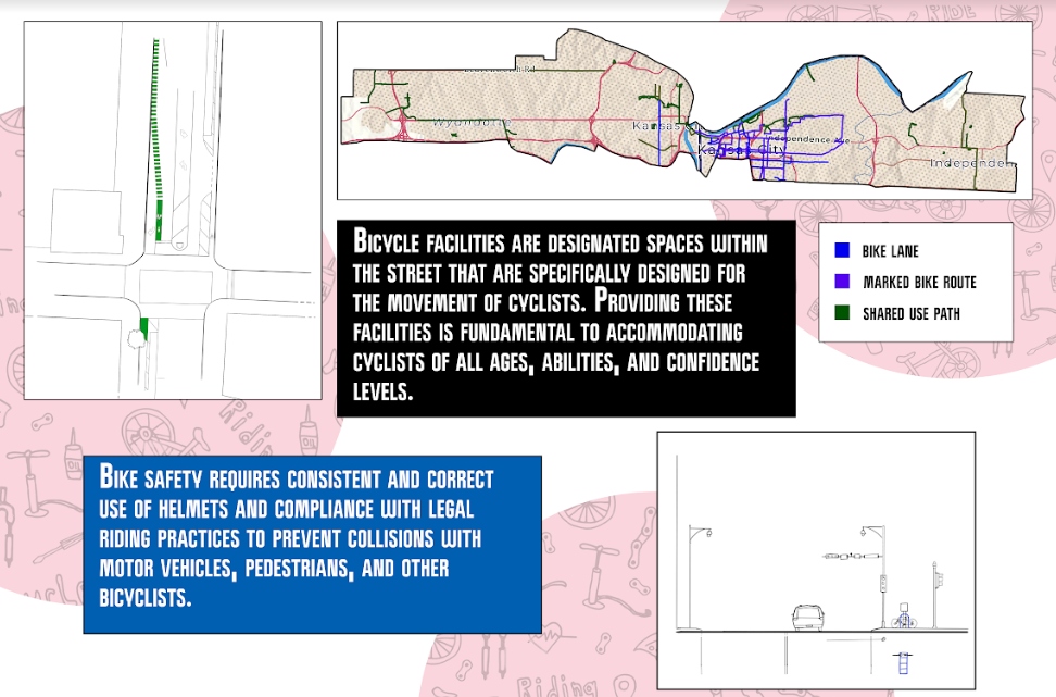
The physical areas that are available to the general public inside a community are referred to as the public realm. It consists of sidewalks, parks, plazas, streets, and other outdoor spaces where people may gather, communicate, and take part in a variety of activities.
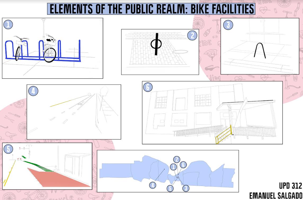
Bike Facilities
This is one kind of element of the public realm. This element encompasses all things bike related. Bike lanes, bike parking, and bike shops.
What you see above is a variety of bike facilities. We have:
Bike Lanes: Designated lanes on streets or roads exclusively for cyclists, providing a safer and more comfortable space for biking alongside vehicular traffic.
Bike Parking: Secure and convenient parking facilities for bicycles, including bike racks, bike lockers, or bike-sharing stations.
Bike Shops: Repair shops equipped with tools and air pumps for cyclists to perform basic maintenance and repairs on their bicycles.
What you see above are visuals and illustrations of bike lanes and bike parking, as well as a map showing existing bike lanes.
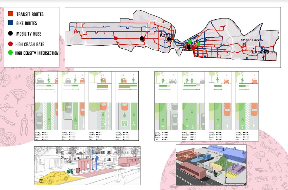
Lastly, what you see above is what I think I should add to improve bike transit and connectivity along the bi-state corridor. I think by adding more mobility hubs, we will be able to improve and increase the use of bike transit. You can see maps showing existing mobility hubs, high density interactions as well as high crash rates. It also shows different varieties of bike lanes as well as different types of mobility hubs.
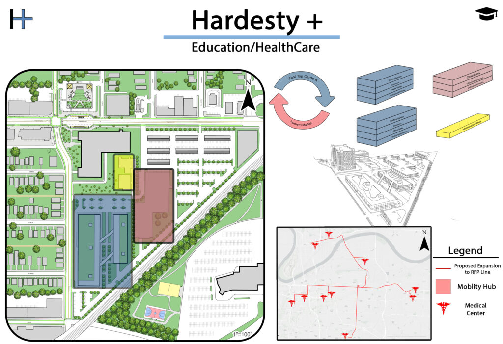
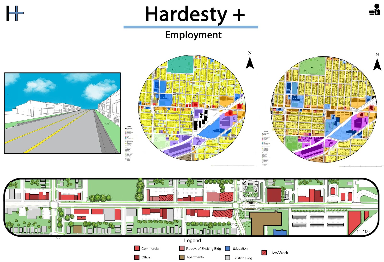
My Area is the Intersection at Hardesty and Independence Ave. My area has a population of 6,129 people with 42.7 % of the area falling between 25 to 54 years old. The Median Household Income is $41,503 with a median Income of $48,160. Now taking these factors into consideration I wanted to also keep in mind Marc’s goals for the Bi-State Reinvestment Corridor which was that of Zero-Emission Transit, better access to Education and Healthcare, better employment, and access to better housing. All these factors were critical points in my design process that youll come to see.
Above, is the Design for my Mobility Hub, I’ve created a food truck plaza with buildings on each corner to accommodate a bathroom as well as a transit center for travelers to go to when waiting. In addition, the site will include a stage to host events on weekends. Off the Site is in cuts to the bus stations to ensure that traffic is not held up when loading and unloading. I’ve also added bike lanes to ensure the area is more connected and forcing semi-trucks that would fall victim to the underpass just east of the site would be rerouted to Truman Rd. Next well talk about Education and Healthcare.
This is my vision for the revamped Hardesty Site. This would be converted to a Market/ Education center similar to that of Summit Tech in Lee Summit that provides access to better-paying jobs to high schoolers. This would be available to all the high schools within the area ensuring we are providing them with the best education possible. In addition, I propose an addition to the RFP line to provide better access to healthcare for those without cars to hospital, doctor offices, and urgent care.
Next well move East to look at my plan for the redevelopment of Independence Ave. This would include moving all stores to the Streetface as well as adding street street trees. I have left some of the existing buildings that can be salvaged as well as keeping some that just need touch ups to keep the identity of the street alive. In addition Changing the zoning codes of the area that include those of having single-family housing along Independence Ave.
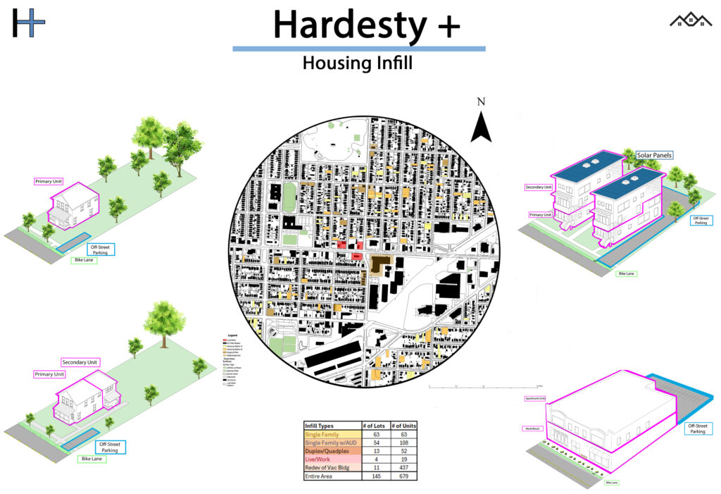
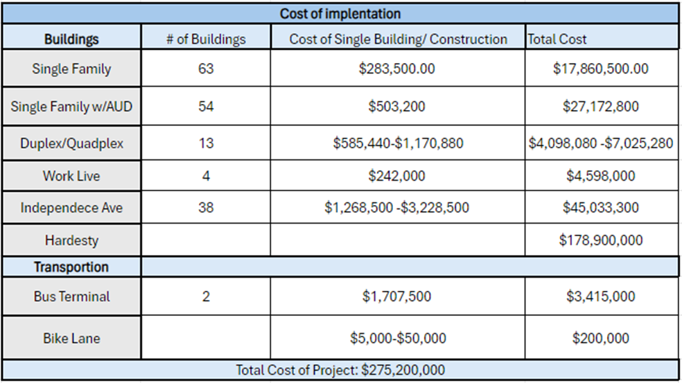
Finally, I’ve included a guide to introduce housing infill to the area that includes some single-family, Single Family w/ AUD, Duplex/QuadPlex, and Work/Live buildings. The area has a large amount of vacant parcels that could be filled to increase access to housing as well as redevelop some existent homes that have become abandoned. With these additions, I would create 679 new housing units. All in all these additions to my area would cost around 275 Million Dollars.
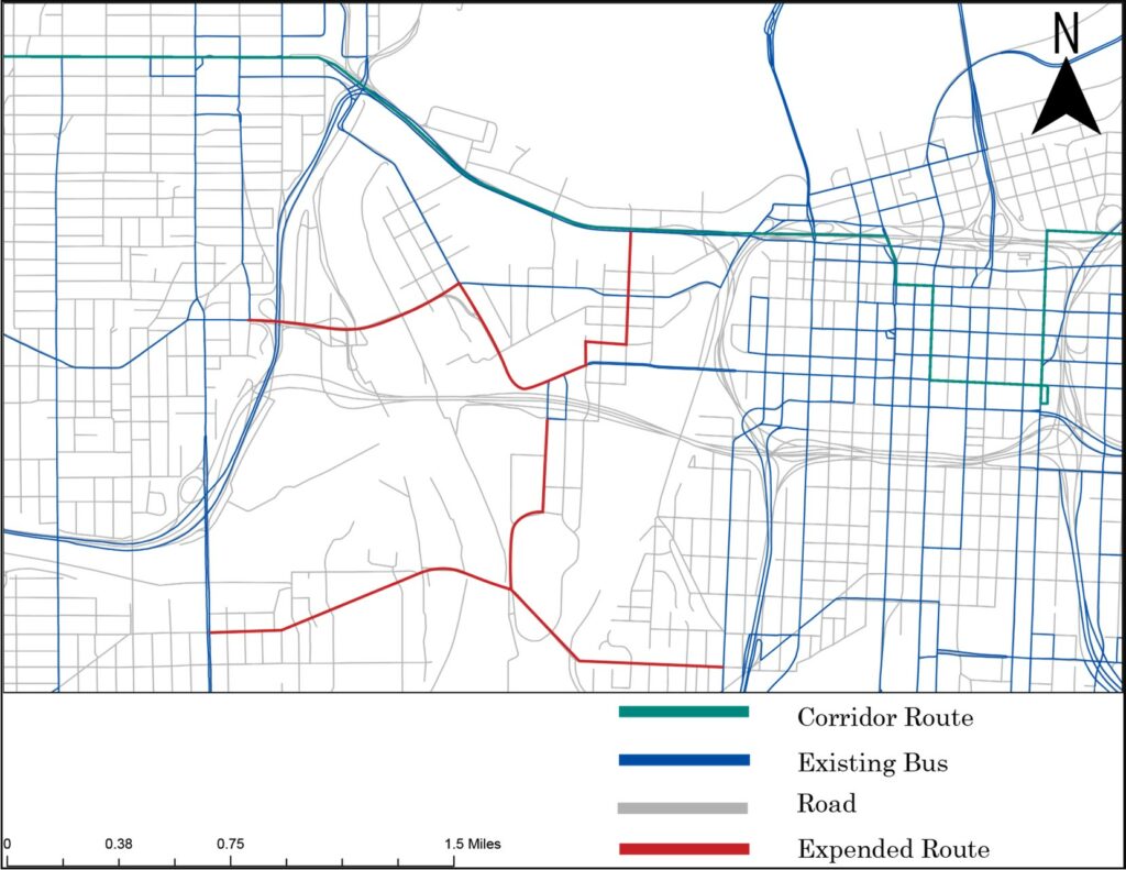
The Bi- State Sustainable reinvestment corridor plan is a regional project that was announced by U.S. Rep. Emanuel Cleaver II and Sharice Davis Rep. to connect three major cities and two states. The project will be connecting Independence square to KCMO to KCK with emphasize on zero emissions transit rout, affordable housing, economic development, broadband access, safety and security enhancements and green infrastructure.
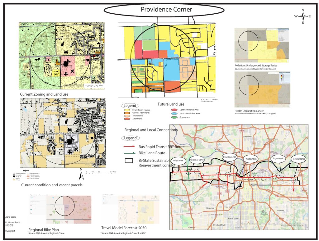
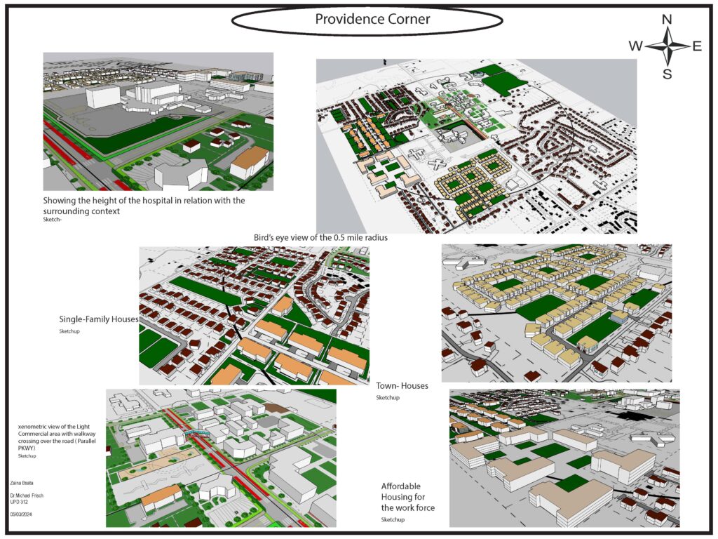
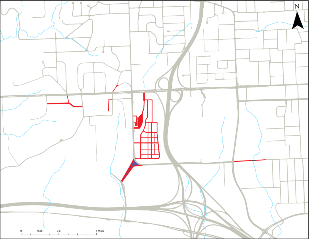
Figure 1: Regional Context map ( Bi-State Corridor plan and the designated area for study within)
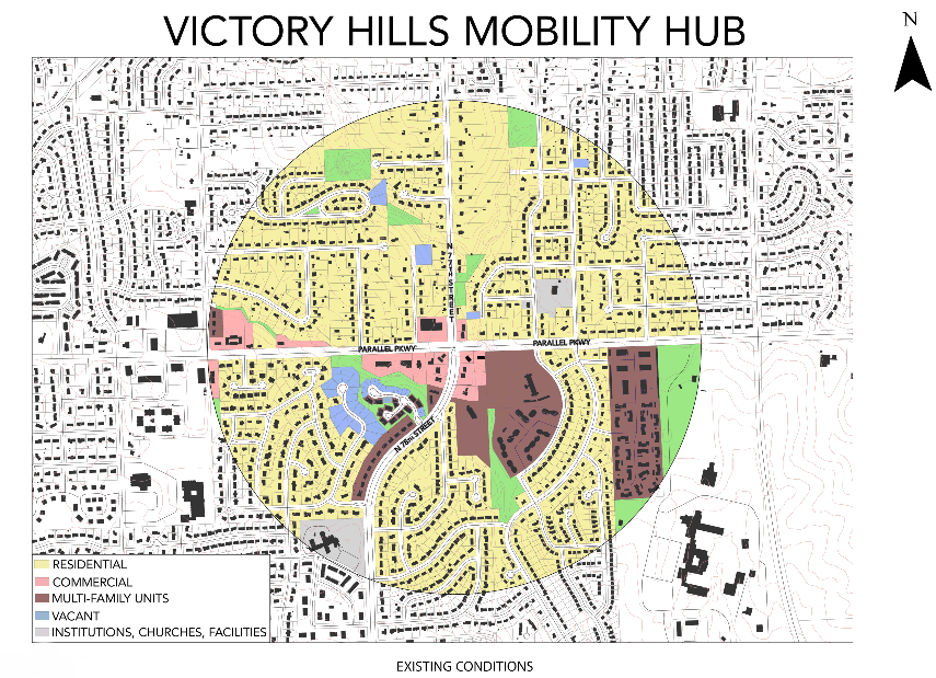
Figure 1 shows the Bi-State Corridor plan with the highlighted circle is the designated area for study ( Providence Corner). Providence Corner is located at the intersection of Parallel PKWY and N90th street. Other areas within the corridor may have suffered from systematic historical segregation, disenfranchisement and disinvestment, but nonetheless, negligence or avoidance could exacerbate existing conditions , simultaneously, this area has great potential to connect the neighborhoods with job opportunities within and outside the corridor, bring higher incomes to the corridor and create more resilient communities.
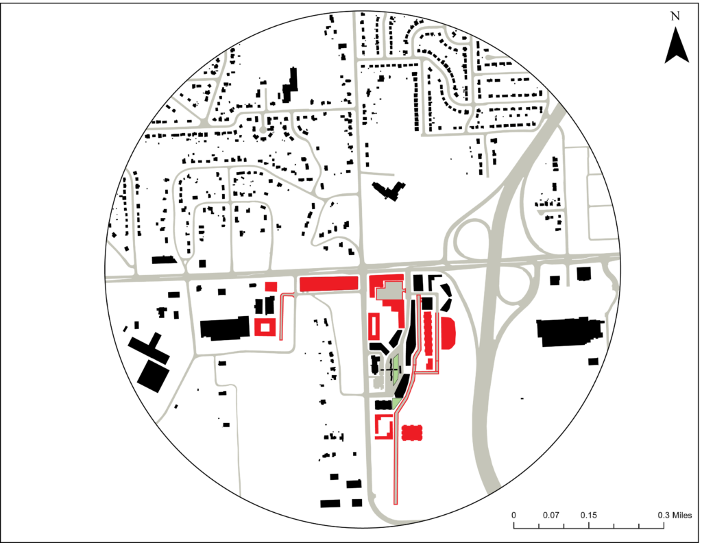
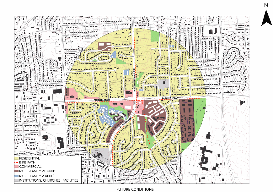
Figure 2: First Board, Regional context map, Current zoning, current existing map and future land use.
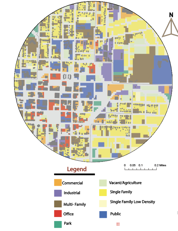
On the First board i explain the existing conditions of the area, the area primarily classified as a half rural area half suburban area with inner-circles of suburban and exurban houses within the 0.5 mile radius with a center point at the intersection of Parallel PKWY and N 90th St. The area has 52 vacant parcels. Examining the area through the Environmental Justice Screen, rates of UnderGround Tanks UGST’s and cancer are the most concerning. Other studies have showed higher rates in Health Disparities in heart disease and diabetes than the rest of the proposed areas within the corridor.
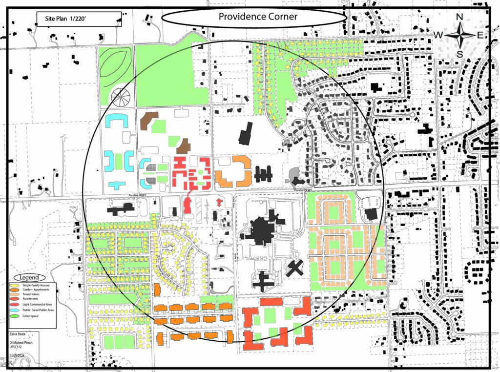
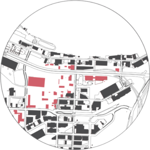
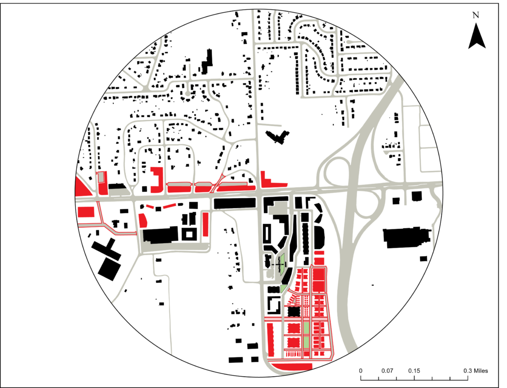
Figure 3: Site Plan of the proposed Transit Center (Mobility Hub) and some of the solutions for the housing units plan.
In figure 3, i propose the location of the Transit Center at the intersection of Parallel PKWY and N 90th Street. I strongly believe this design plan will improve the area, expand on business opportunities, create dense- community focused development that is walkable and scaled appropriately to the neighborhood , and increase the amount and quality of the green space.In my proposition, i addressed the urgent need for a Child Care Center in the area especially that we have an elementary school. The area is suffering from the lack of Art Museums and Art Venues, and it’s a food desert where the closest grocery store is located more than half a mile radius which would require that every house has a vehicle and based on studies they don’t.The plan addresses all of the significant issues while adding more vital services and amenities to area, such as hotels for the increased number of visitors to the area and the hospital and medical facilities, retail stores and medical offices on the upper levels in service of the Providence Medical Hospital and Community Center for community gatherings especially after certain services at the church on the opposite side.
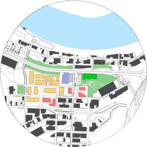
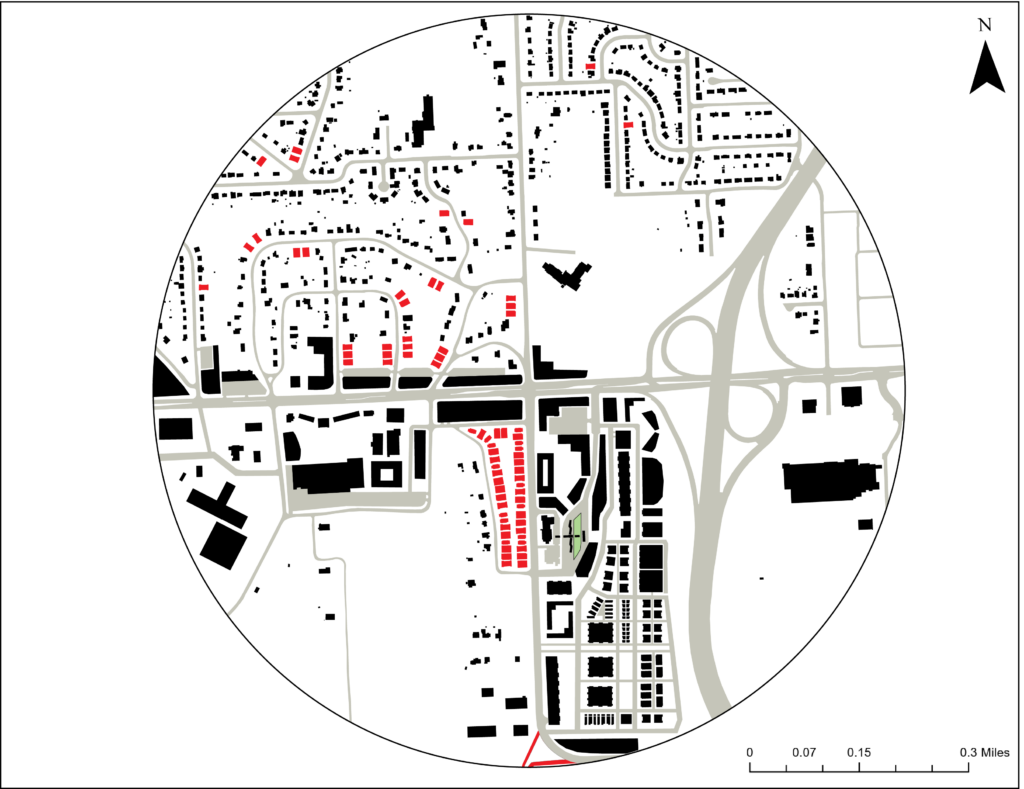
Figure 4: Site Plan of the 0.5 mile radius.
Figure 4 shows the site plan of the whole area within half a mile radius zone. The area is in much need for sidewalks, pedestrian crossings and bike lanes to improve the health of the residents and access to green spaces. In my design i’ve created green space at the NorthWestern part of the land to create and maintain its connection with much larger green area ( the Wyandotte County Lake ) through pleasant shaded trails. Different types of housing units that satisfy the requirement of 500+ units and much more. Single-Family detached units is the prevailing housing type in this area, with my plan i give more choices( Equity Planning) to the existing residents and future anticipated residents. We have a housing crisis that is going on now and its massively growing fast. We are missing what we call the Missing Middle of types of housing and my plan offers that missing middle from Town-homes to Garden Apartments to Affordable apartments for the work force and other types of apartments just south of the Elementary school that is located North of the Providence Medical Hospital.
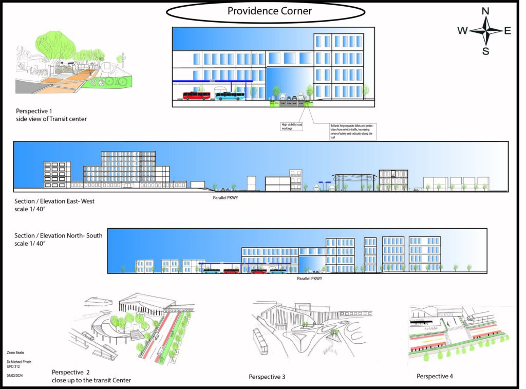
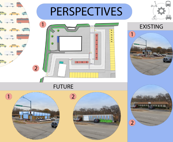
Figure 5: Multiple Elevations and perspectives of the proposed Mobility Hub
Figure 5 takes a close look at the proposed Transit Center that connects residents of the neighborhood with their Employment Centers and the with other parts within the corridor such as Village West to the Far West or KCK, KCMO and Independence Square to the far East.
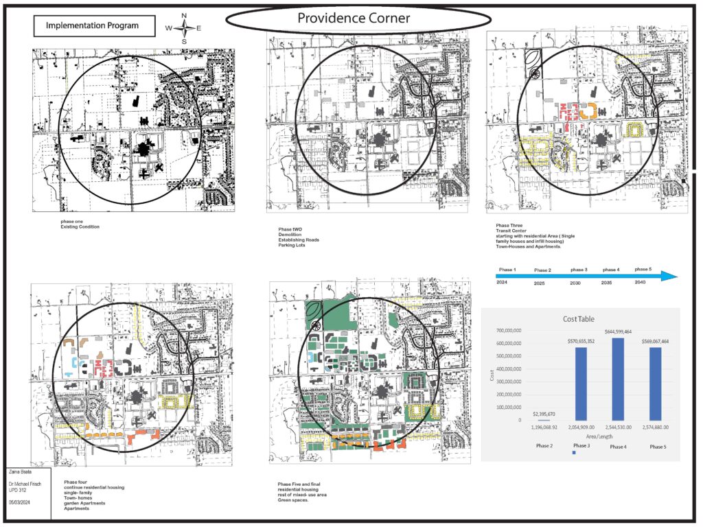
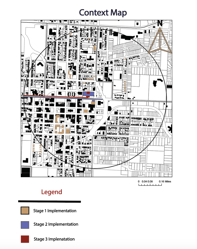
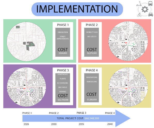
Figure 6: Implementation Plan.
My implementation Plan will start with adding roads and parking lots within the first year, then the following five years will be building the transit center and the light commercial area to the north of the transit center in order to start having revenues that will push forward building out the sites and some residential units. Phase three, will be continuing with another group of housing units, finishing up the commercial area, Art Center, Music Center,Child Care Center and one of the Hotels.Last phase will be the second hotel, Second Child Care Center, the rest of the residential units and green spaces.
Figure 7: Multiple perspectives of the project Providence Corner.
Last Board shows multiple perspectives of the proposed project, either Bird’s eye view of the whole area with the transit center or the types of housing units.
In Conclusion:
This project, Providence Corner is the perfect solution for much needed connectivity for the East West corridor, ensuring safer walkable neighborhoods for the residents and making sure that all groups including vulnerable groups have equal access to education ( KCK Community College e.g.), Health and Job Employment Centers which creates more resilient communities and reducing if not avoiding social and environmental injustices that could emerge or increase in the forceable future if not resolved in the present.
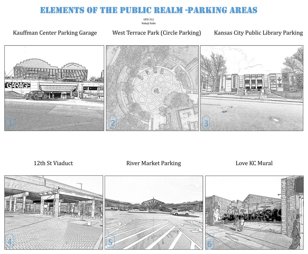
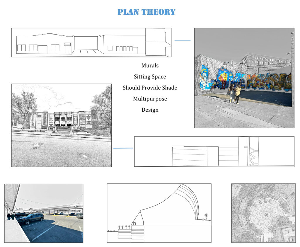
Kansas City, like many other American cities, has a parking problem. There is almost a parking area on every corner of downtown Kansas City and, yet people complain about parking unavailability. As part of the public realm, we should take more consideration when designing parking spaces. How can we make parking spaces more suitable for our cities and more pleasing to look to be around? I looked at some of the parking spaces in the Kansas City area that I think are well-designed. As part of my search for a space, I was looking for elements like art, murals, multifunctional spaces, shading, and spaces where you could sit especially garages. I looked at the Kansas City Mural, Kauffman Center parking garage, River Market, The 12th St Viaduct, and finally West Terrace parking. These parking areas had an aspect I think should be standard for all parking areas.
The first parking area I had in mind was the West Terrace Circle Parking, I like this car park simply because of its city floor design. Not a lot of consideration goes into designing parking spaces, which is why a lot of parking areas look depressing. The pattern changes also encourage slower driving. The parking area is also in a of the highest points in the city where you can oversea a lot of great view into west bottoms and surrounding areas.
The first parking area I had in mind was the West Terrace Circle Parking, I like this car park simply because of its city floor design. Not a lot of consideration goes into designing parking spaces, which is why a lot of parking areas look depressing. The pattern changes encourage slower driving. The parking area is also at one of the highest points in the city where you can overseas a lot of great views into the west bottoms and surrounding areas.
Multipurpose parking is another great way to use parking spaces. Parking that can be used for things like setting space when necessary, parking that can be turned into a weekend market space. When people occupy spaces that were designed for cars, I think that is a good parking space.
Parking with shade. It is not a secret that every parking space has almost too little to no shade. During the summer heat, shades are the most valuable spaces parking look for, heck even cars, overheating is a real issue. So underground parking like Kauffman Center with its ground parking does not take up any surface space, it also leaves a nice green space on top for people to have fun activity on top of the garage. Spaces parking however should incorporate shade into their designs.
For our final 312 studio project we were tasked to create a mobility hub along the Bi State Sustainable reinvestment corridor. Each studio was assigned a intersection from East in Independence Square to Village West in KCK.
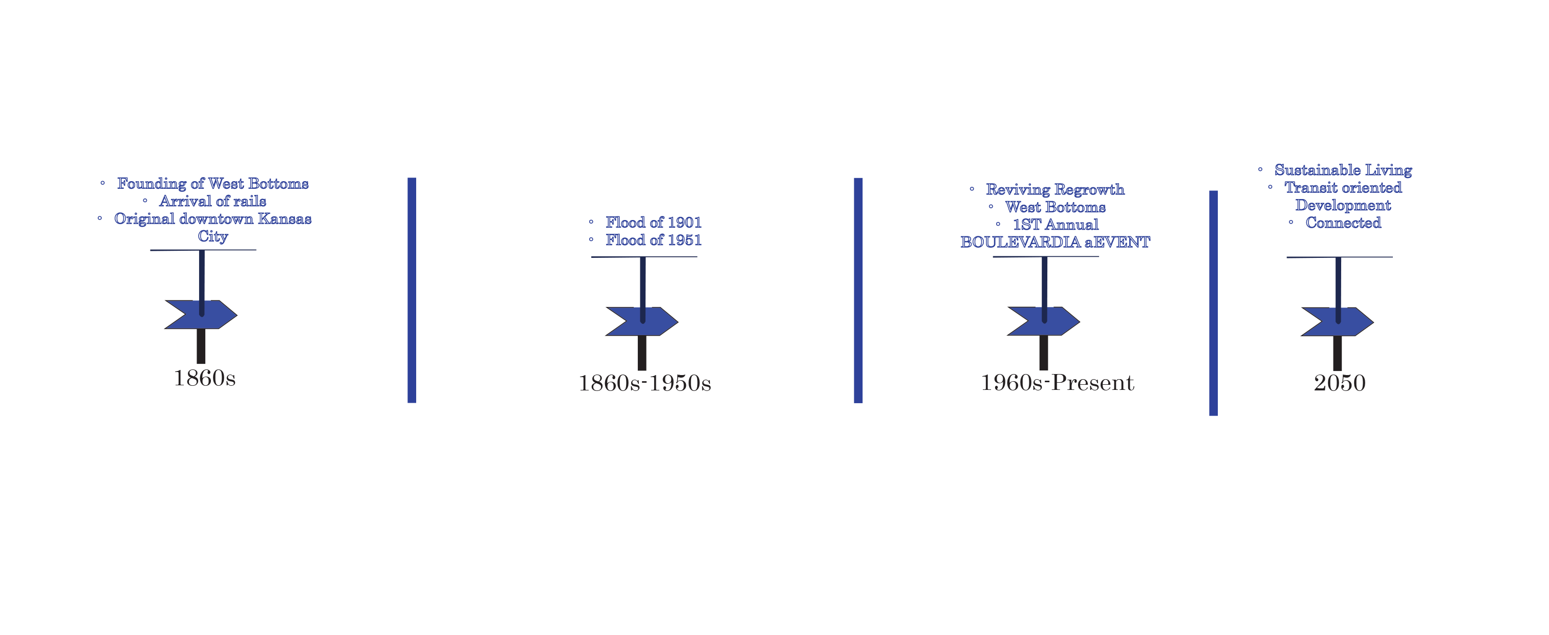
Figure 1. History and Background
The West Bottoms has long been an industrial land use after the flooding in 1901 and 1951. All forms of residential land use were brought to what is now downtown Kansas City. The area has begun its regrowth and has become a potential residential development district again.
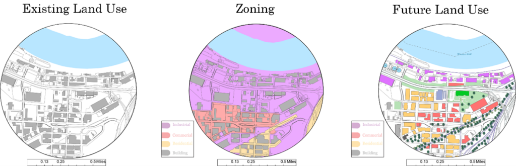
Figure 2. Existing land use, zoning and future land use.
Figure. 2 shows the existing land use, zoning, and future land use in the half-mile radius. The current area consists of a single apartment flat a few commercial and use and mostly industrial use. The future land use will consist of new residential and renovated ones over five. A few industrial uses will be kept on the north side of I-70. With new commercial development in the middle of the area.
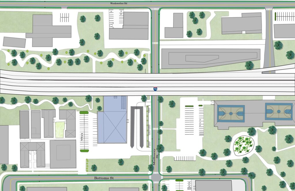
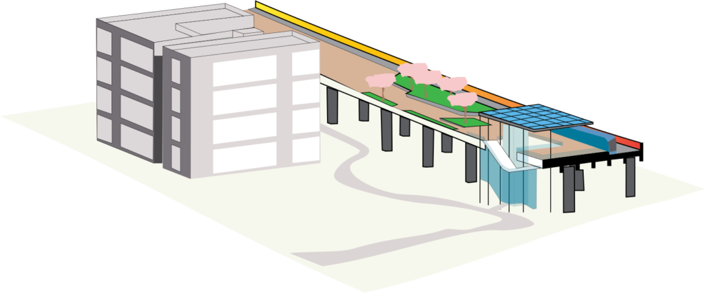
Figure 3. Mobility Hub
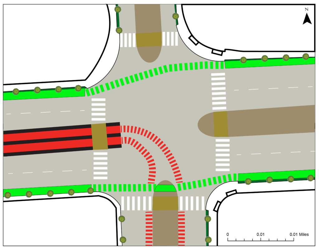
The mobility hub is located at Mulberry and Highway 70. In the blue is the transit center, with a pavilion that covers enough for buses. The design has bike lanes, sidewalks, trails, and improved crossing. Ample parking spaces for residents and visitors.
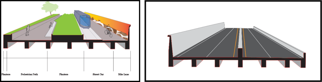
Figure 3. Highway 70 Redesigned Section
The obstruction disconnecting the KCK, and downtown Kansas City Missouri is the 7-lane I-70. It currently only carries high-speed vehicular traffic. Considering that, inclusive transportation can not only connect the bi-state but also improve the environment. The 7-lane highway will be turned into 4-lane vehicles with reminding lines going to streetcar, planter, pedestrian path, and bike lane.
Figure 4. The Street Car Stop
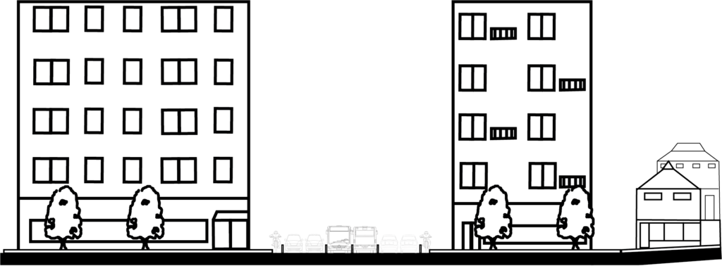
The streetcar would direct connection to the ground and the apartments, with ample green space and pedestrian path.
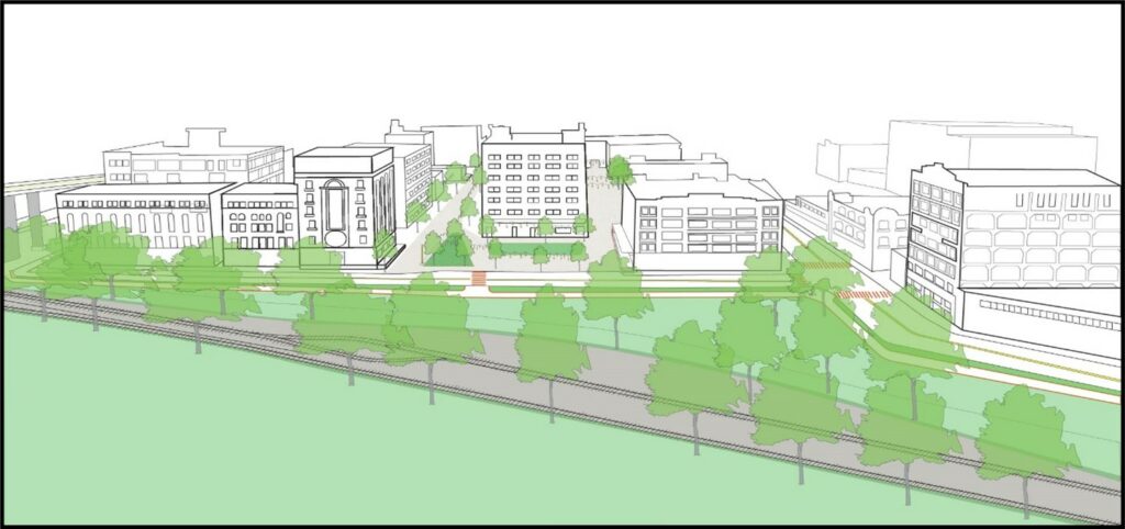
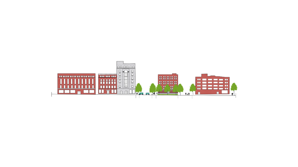
Figure 5. Redevelopment District
Redevelopment district
Figure 6. Elevation of the Redevelopment District
West Bottom has ample connections from both sides of the states. It has highway 70 and highway 670 going through it. Its also got 12th Street, and Centra Bridge Ave that connect to downtown, City Market, redevelopment district, and industrial district.
Figure 7. Connections
KCATA has multiply routes in the West Bottom. With the new BRT in the West Bottoms, I extended the bus routes South of West of Bottoms to give residents other options besides driving personal vehicles.
Figure 8. Existing Public Transportation and Extended Route
The Implementations will be done in four phase. First we will begin the demolition phase to prepare for new development, and undergo brownfields cleanup and the area to prepare for new development. Phase 2 will start the new apartments development and the mobility hub along with redevelopment of I-70. Also extending the road network in the surrounding areas. Phase 3 will pick up after phase 2. with redevelopment district a renovating the existing infrastructure and converting those to new apartments. Phase 4 will focus on commercial land use, and any additional development to make that West Bottoms is thriving.
For our final studio project, we were assigned different mobility hubs across the bistate corridor. The mobility hubs would assist the bistate reinvestment corridor in addressing issues such as access to housing, a reduction of carbon emissions and creating a more pedestrian friendly area by reducing the usage of vehicles and improving access to public transit via mobility hubs.
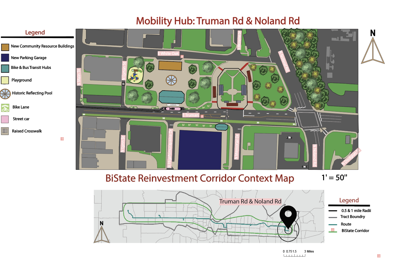
The focus on this mobility would be on Independence Square, located on the intersection of Truman and Noland roads. This already existing transit stop can add more connection from Independence to the greater Kansas City area. Existing is the roundabout bus stop for busses in independence. This transit stop adds access to the surrounding Independence with frequencies that are more that 30 minutes apart and could simply be better for the community.
While keeping the existing transit stop and improving frequencies, this could be the start of the improvement of the mobility hub for Independence Square. In addition, the area would see the installation of new homes and apartments, which would create a denser area suitable for heavy transit use.
The existing land use around the mobility hub shows that it is mostly public area. This is staying the same as far as zoning goes, the surrounding area around the mobility hub is mostly single-family zoning and some multifamily zoning. These are where most of the empty lots are, and we are going to add our infill of houses single family 2-3 bedroom and also our 166-unit apartments as well as our 6-unit 2-3 bedroom townhomes.
The Implementation of this project would start with the infill housing project and adding housing within the half mile radius.
The second stage would start the construction of the transit center for our proposed streetcar stop, the stop would start with the implementation of electric busses but could potentially shift to a streetcar in the future following studies of how the new transit stop works. The second stage will also install the bike lane and make use of the parking garage on the first floor to add the bike share floor for those who choose to use biking as their form of transit.
The final stage of implementation would just finish up a couple of details such as adding a resource for the community and finish the mobility hub building. Once this project is finished the greater connection to Kansas City can be analyzed and studied for to decide if a streetcar would be suitable for this area in the grander scheme of the Bistate corridor.
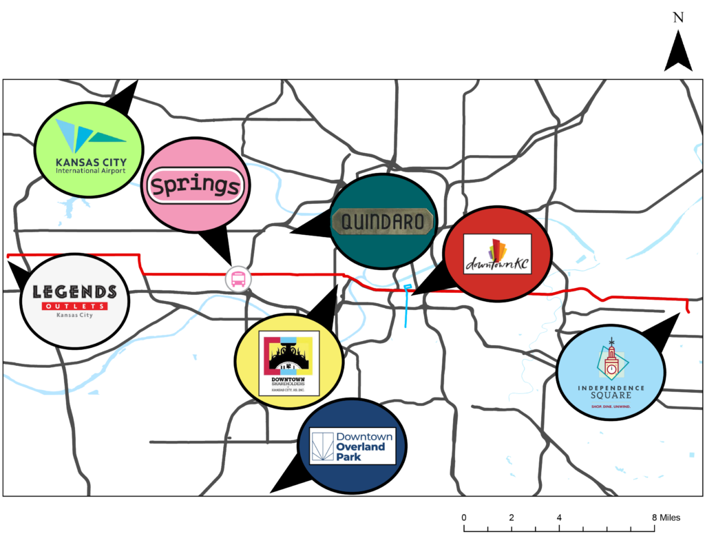
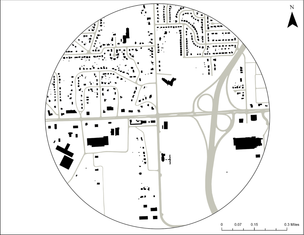
For our final project of UPD 312 we were tasked with designing a mobility hub along the Bi-State Sustainable Reinvestment Corridor at a randomly assigned intersection. This corridor is a regional planning effort spearheaded by the Mid America Regional Council (MARC), in order to build a new zero emissions public transportation option from Independence Square to Village West in Kansas City, Kansas. This will connect four cities, two counties, two states, and 191,068 people in the Kansas City metro area.
Figure 1. Regional Connections
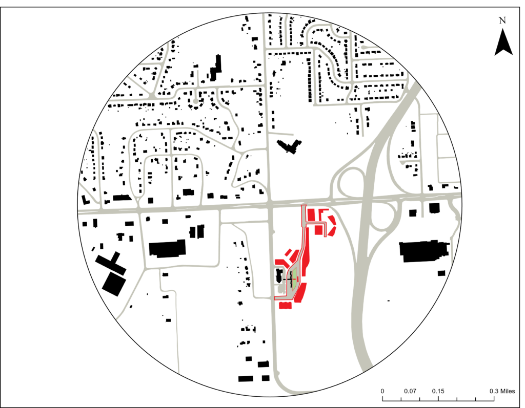
Specifically, The Springs focuses on I-635 and State Ave in Kansas City, KS where the Indian Springs Mall used to reside. Since the removal of the mall the southeastern corner of the intersection is completely barren except for the KCK Midtown Transit station and the Police Station next door. Strip mall style commercial lines State Avenue with many auto-oriented gas stations and car repair businesses set up along the street. single family homes back these businesses on both sides of State Ave meaning if the mobility hub were to occur along State the development opportunities would be limited and lots of demolition would have to occur for this to be a reality. To minimize the demolition that occurs and to ensure fast and frequent connections throughout the metro I proposed the mobility hub be located directly next to the Midtown Transit Center within the old Indian Springs Mall site.
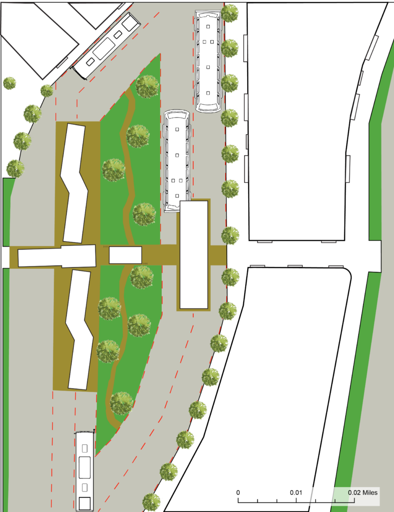
Figure 2. Detailed Diagram of My Mobility Hub.
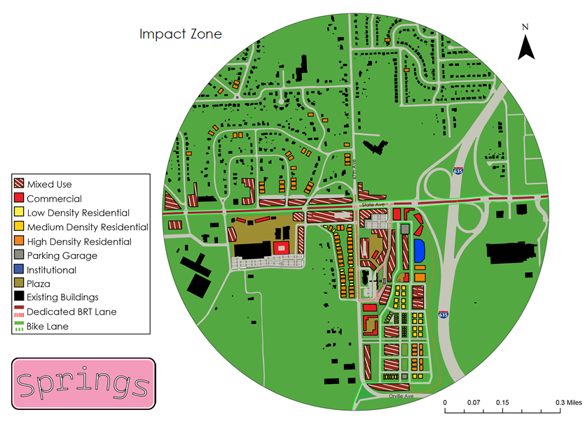
Figure 3. Half Mile Impact Zone and accompanying Land Use Diagram
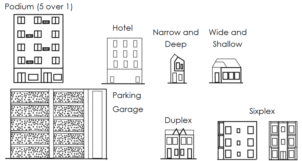
Given the previous vacantness of the site I took inspiration of various New Urbanist developments in suburban areas throughout the United States to put as much housing in this new area as possible. In total when the project is completed 3,143 new units will be added to the half mile radius and all the development will cost $998,443,552. There will be various types of housing throughout The Springs spilling over into the half mile area including various types of single-family homes, duplexes, six-plexes, and podium buildings of various height. Figure 4 shows the building typologies found throughout The Springs.
Figure 4. Housing Typologies
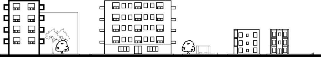
Incorporating a variety of housing types into this area increases diversity and provides for an interesting and varied streetscape at the pedestrian experience. This development is not just new building footprint though, there are several greenspaces implemented throughout which provide a change in scenery compared to the heavily built-up areas of The Springs. Figure 5 shows several of these greenspaces in section to demonstrate how it works within the built environment.
Figure 5. South Section
Taking advantage of the existing Midtown Transit Center was one of the primary ideas which helped to inform my design of The Springs and so it was very important to me to improve the transit service it offered so better regional connectivity could be offered. Figure 6 shows the transit services offered from The Springs Mobility Hub including both the Transit Center and the BRT station. Currently the Midtown Transit Center offers service along the 101, 102, 106, 113, and 116 all which run east to west in KCK along different major streets. The 106 connects to the East Village Transit Center in KCMO which in itself connects to most other parts of the metro. To supplement this in addition to the BRT I am proposing two new routes the 129 and the 405 which will serve as north south connections from The Springs. The 129 will connect north to KCI connecting the mobility hub to the airport and the Northland as a whole. The 405 will run south connecting the mobility hub to downtown Overland Park one of the most pedestrian friendly areas in Johnson County.
Figure 6. Public Transportation from The Springs
In addition to public transit, I plan to improve the pedestrian and vehicle connectivity in the region by adding missing sidewalk infrastructure in many of the neighborhoods to the north and east of The Springs and also building a bridge over a creek to the east along Orville Street. These ideas can be seen in Figures 7 and 8. New bike lanes will also be added along State Ave and within The Springs to ensure cyclists are protected from vehicular traffic.
Figure 7. New Road Network
Figure 8. New Sidewalk Network
I am proposing the BRT will be center running and have dedicated lanes in the middle of State Ave. This may be unorthodox for the region, but I believe by dedicating the most valuable infrastructure to this new transit system, the speed and efficiency the transit line will run at will match the transit-oriented future the Bi-State Sustainable Reinvestment Corridor is aiming to achieve. Figures 9 and 10 show the functionality of these center running lanes and the improvements which will be made to the intersection of 47th and State Ave.
Figure 9. 47th and State Intersection Improvements
Figure 10. State Ave Section
Implementation for this project will happen in four phases. The first will see the building of the BRT station and the new road infrastructure needed for its operation in addition to slight surrounding commercial development. The next phase will see the demolition of some buildings along State Ave and the development of many mixed used buildings on the north side of the sight which will have commercial on their ground floor. The third phase will see construction of mixed-use buildings to the west on State Ave as well as lower density residential filling out the new streets towards the southern end of the development. The fourth phase will see infill of single family and six plex units in the surrounding neighborhoods to the west and north of The Springs. Figures 11-15 represent my implementation strategy.
Figure 11. Existing Conditions
Figure 12. Implementation Stage 1
Figure 13. Implementation Stage 2
Figure 14. Implementation Stage 3
Figure 15. Implementation Stage 4
Overall, The Springs is a great development opportunity for KCK and the entire region as it will provide an exciting new area of commerce, walkable living, and connectivity through vehicular and public transportation means to the rest of the metro. The empty nature of the site provides for truly endless potential, and I believe The Springs emphasizes New Urbanist principles which will make, living, shopping, and working in the area more enjoyable.
In the ever changing landscape of urban development, one concept has been gaining significant traction and promising to improve the way we navigate our cities:
Mobility Hubs.
These hubs represent a shift in transportation planning, offering a different approach to connectivity, sustainability, and community engagement.
What are Mobility Hubs?
At their core, mobility hubs are transportation nodes designed to connect various modes of transportation, such as buses, trains, bicycles, ride-sharing services, and pedestrian pathways. They serve as locations where different transportation options converge, facilitating convenient and efficient transfers between modes.
My Mobility Hub
The location of my mobility hub is in Kansas City Kansas. Victory hills.
What you see above is what currently exist in this area.
What you see above is the future conditions or in other words, what my plans for the future. The white is the new buildings and new streets. There are new affordable houses, apartments, mobility hub, and a mix-use buildings.
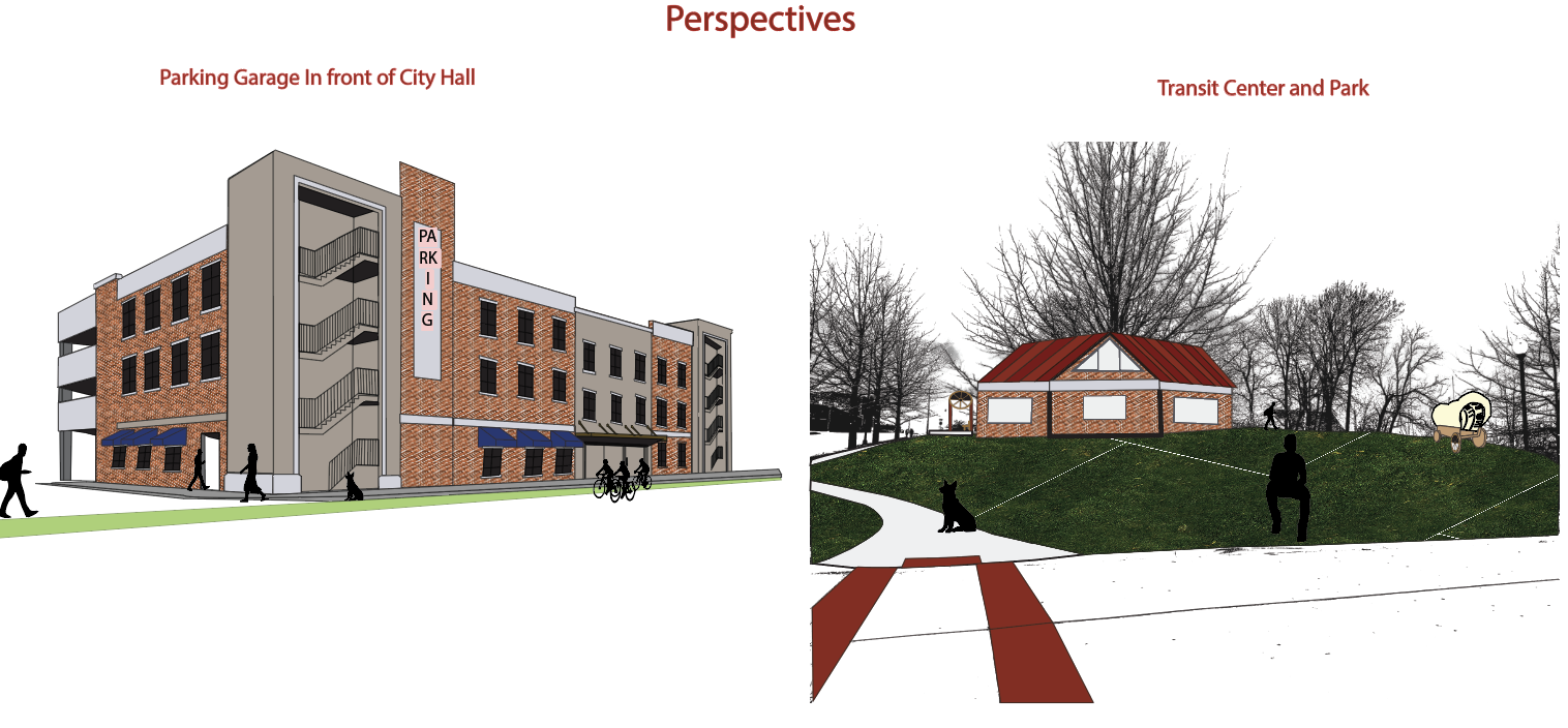
What you see above is are the perspectives for my mobility hub and a plan view of the mobility hub.
There is EV- charging, car share parking, and even bike and scooter parking.
Lastly, this is my implementation board. Each side shows what will be included in each phase and how much it will it cost per phase. At the bottom it shows the total project cost and the completion date of the this project.
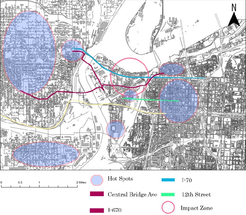
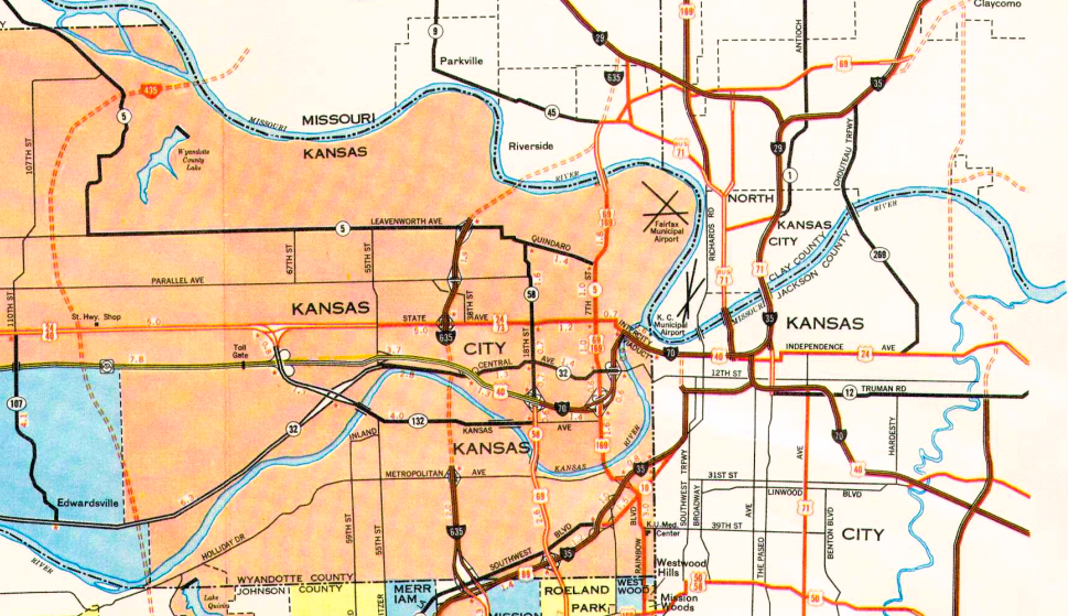
The first road developed as a highway in the Bi-State Corridor was the Kansas Turnpike. Finished in 1956, the turnpike’s initial plan predated the interstate highway system, although it was incorporated into the system later in the same year. Now, the part of the turnpike that runs east-west through the corridor is I-70.
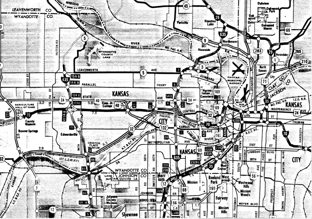
After the turnpikes construction began the multi-decade long highway project that would eventually become I-435, encircling around the Kansas City metro area and serving as the West boundary of the Bi-State corridor. The project started in 1965 in the east, although it wasn’t nearly twenty years later in 1986 till the project reached the western boundary of the corridor, as seen in Map 1. The highway was eventually completed one year later in 1987.
Map 1. Kansas Historical Road Map 1986. K-DOT
During I-435’s construction, the creation of another highway, I-635, also began its implementation. Beginning its construction in the late 60’s, the first year that the corridor saw a completed segment of the expansion was in 1973 between Leavenworth Rd. and State Ave, as seen in Map 2.
Map 2. Kansas Historical Road Map 1973. K-DOT.
These three highways: I-70, I-635, and I-435, define most of the highway landscape on the Kansas side. I-70 provides the primary commuter connections for travel within the corridor, while I-635 and I-435 provide the main commuter connections to the northern and southern parts of the region .