Elements of the Public Realm (Signage)

For this project, we were asked to take photos within our assigned area or outside the assigned area but still with The bi-State Corridor boundaries.I went ahead and took multiple photos, most of them within my area which is the far West side of the corridor and multiple others i thought were important and critical in illustrating my points. First we need to identify what a Public Realm is? A public Realm is for every one, it consists of starts, parks, green spaces and other outdoor spaces that are available without charge with everyone having access to. Public Realm is not isolated but it is within the context of it’s surrounding buildings whether private or public.Three key factors influence the public realm, which are, the buildings that define the space, the space itself, and the residents who live in those places.My assigned element of the public realm is signage. Signs are visual graphics created to display information to a particular audience.It is the Design or use of signs and symbols that convey the message.The term signage is documented to been popularized between 1975 and 1980.Then, it came to use in the 20th century to describe a class of signs typically for advertising and promotional signs.

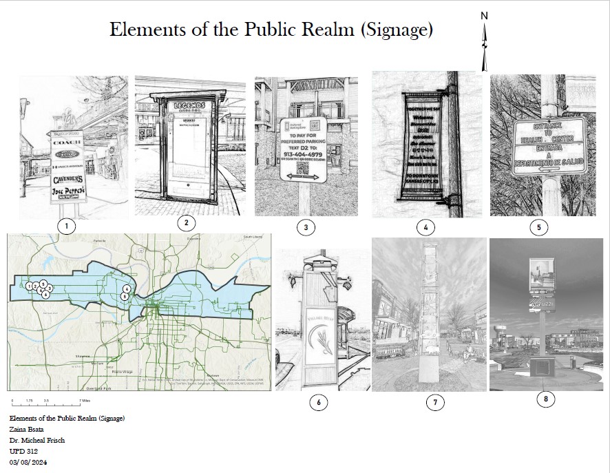
Figure 1 First board ( 8 photos captured within Corridor boundary)

The first board (Figure 1) shows multiple photos i took within the corridor boundary, with most of them in and around village West-located at the far west of the corridor- some at KCK Downton and some around The Kansas City museum in the state of Missouri, with an adjacent context map to show the locations of my photos. I rendered my photos using photoshop to give some certain effects to my locations and emphasizing on certain points of the signs that will later on develop my theory on the signs and my findings.photos number one and two are chosen in the Legends outlet in KS, one shows how signs can reflect prominent figures of the area, two is just the closest basic example i could found in the area for navigational signs. Number three is great example to show hierarchy of the design with a white background and a QR code and it is taken in Great Wolf Lodge, KS .Number four and five are taken close to the Wyandotte City Hall, KS on Ann Ave, that area is more diversified than Village West where the legends outlet is, so we have multiple languages spoken there and that is reflected on my two signs.Number six is in the Village West area and it is a good example of identifying the place, aesthetically beautiful with the ability to add some features to it in the future like Music and Wireless internet access.Number seven is in the Legends Outlet, and it is a good example of defining public space with advertising simultaneously with the names of stores being displayed on, plus the proportionality and emphasis ( 7 principles of design). Last Photo was taken at the parking lot of Nebraska Furniture Mart, great way of defining and dividing the parking lot with definitely unique way of looking at it and some possible features to add as well in the future.

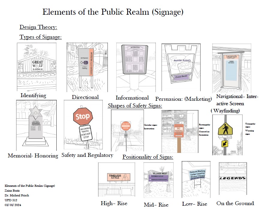
Figure 2 ( My Design Theory and what i’ve developed)

The second board (figure 2) shows the types of signs that i’ve discovered and put together, either with traditional ones that we all are familiar with or with new type of signages that are getting popular. Signs has seven types, they could be Informational, directional, identifying, persuasion, Navigational(interactive screen), Memorial and safety and regulatory. Identifying is to indicate services and facilities at the area such as room names and numbers. Informational, conveying information for services and facilities such as maps.Directional, showing the location of facilities, services and key areas such as directional arrows. Persuasion, promotional signage to persuade users of the merits of a company like highway signs and billboards.Navigational, maybe interior or exterior with interactive screens, most likely found in tourist attractions sites and museums with other ways of dynamic “wayfinding”.Safety and regulatory, signs giving warning or safety instructions such as warning signs, traffic signs and exit signs.Memorable and Honorary signs, those are dedicated to remember the service of a certain group of people or honoring beloved family members. There are different shapes of signs as well, they could be circular ( instructions), Triangular(Warning signs) and Rectangular (General information). Positionally of the signs affects a lot as well. Signs could be positioned very high like billboards and highway boards, Mid-Rise like identification boards, low-rise like informational boards or on the ground like identifications sign.

Figure 3 ( sections and my design intervention along with a perspective)

In figure 3 i had two sections illustrating the relationship between a human’s scale in relation with boards scale and specifically their height. First section is the scale relation ship between human and highway boards. Second section is the relationship between human and mid- high and low boards. My boards also contains to the up far right, traditional dimensions of well know boards. A perspective to the far left side.Then my design theory was about adding features to signs that are related to the Bi-State Corridor Goals and Marc’s goals. One of the goals is Broadband access, and with that i’ve added some new features to my navigational sign like wireless internet access. Other features could be added like light features and music. Another goal with the Bi- State corridor is security enhancement. With that i’ve added some features to my navigational sign like facial recognition cameras and connection with the police. License Plate readers could be added to signs or light poles that are adjacent to signs. Pedestrian crossings could be enhanced a lot as well by adding those new features to pedestrian crossing signs , light, connection with police centers and license plate readers.

Signs are always improving and they’re could be new ways of showing them in the future with new functions and far more features than they incorporate now.

Elements of The Public Realm

For our last project we were assigned an element of the public realm such as sidewalks, trees, or bus stops and were then tasked with creating several boards diagraming these elements and explaining how they either enhanced or ruined public space. My assigned elements were walls fences and bollards of which I decided to explore the nuance of what makes a good bollard.

My First board focused on my renderings of examples I found of my assigned element. These examples were supposed to be located within the Bi-State Sustainable Reinvestment Corridor, an area defined by MARC, the local MPO, as a place of strategic investment for the region. These renderings were completed in Photoshop and highlight the specific element at work in the public realm. Most of my examples were found within the Northeast but several are from downtown KCK and one is just north of Parade Park.

My second board includes additional diagrams of several elements of note. First in the top left I have a site plan of the Wyandotte County Courthouse and Juvenile Services Center to show how bollards are being used to protect entrances to each building. To the right I have elevations showing these entrances and the bollards and walls protecting them. Moving right I have a site plan of the Kansas City Museum and the fence which surrounds its perimeter showing how the fence does not serve to keep people out of the museum but instead guides them to the correct entrance. Below this is a site plan of a bike lane bollard and the entrance to Cliff Drive showing what measures have been taken to close Cliff Drive off to cars and keep cyclists safe from vehicular traffic.

My next board goes into detail about the design standards for specific types of bollards and what they add to the built environment. At the top of the board, I show the Bike Bollard on the sidewalk next to the Cliff Drive entrance. This is a bad use of these type of bollards as they serve as protectors of cyclists in high traffic areas. However, since the Cliff Drive entrance limits vehicular traffic there are not many vehicles coming into contact with the bollard. The sidewalk is also not wide enough for the bollard and cyclists may run into it given how hard to see it is. I have brought in standards from the Great Rivers Greenway a trail network in the St. Louis metro area to show how the bollard is lacking in these ways. Below this is the Wyandotte County Juvenile Services Center entrance which is protected by bollards, walls, and stairs. To show how these protection agents serve their purpose I have brought in FEMA guidelines for Border Security Planning outlining several goals to secure a facility. Balance Security and Vitality is met by the development itself as five years ago this lot was just a parking lot and the bollards, steps, and walls add to the built environment providing vitality to downtown KCK. This leads into the second goal Streetscape Enhancement as the steps provide public seating in a place where people are walking around, and the plantings provide a pleasant atmosphere when walking down Ann Ave. Diversity of Barrier Systems is met by having walls, bollards, and steps to provide protection to the entrance to the facility. This diversity of protection is executed in a cool way by incorporating the natural slope of the street to use stairs to preserve this elevation instead of leveling it out, an interesting practical design choice.

Elements of Public Realm

This assignment was to analyze Elements of the Public Realm within the Bi-State Sustainable Reinvestment Corridor. I was assigned Lights with this I wanted to look at the relationship that lights had with Community Centers as well as how lights that were in these Centers differed from the lighting made for cars just seconds away from these Centers.

After my analysis of the Lighting I decided to set a Standard for lighting from 1 of the 4 examples I found and use that standard as a blueprint from redeveloping Genesee St in the West Bottoms. The Reason for this selection was based on how ripe this area is for a New Community Center and the lack of a diversity of lighting within the area As you can see in the Board below.

From the Standard I added a lot more Lamp post along the street to make the area more welcoming to pedestrians. As well as moving Lemonade Park to having more of a relationship Genesee and the numerous Business that line the street opposed to being on the back side of the Block. In addition Perspective 3 shows a nice outside seating area that had no outside lighting so I added some nice string lights to create a intimate dining experience from the restaurant. Overall I wanted to improve the streets lighting when it came to the pedestrian experience and with these changes I believe this street would become one of the Community Center that people love to come to.

Analysis of the Corridor


 Figure 1. Assets of the corridor: Schools, vacant, lots, & learning facilities.

In this analysis of the corridor i was tasked with finding the environmental sides of the corridor. My task included mostly the land uses of the buildings in use along the corridor. Above on figure 1 I found the schools/learning facilities along the corridor as well as the vacant lots that are long the way. These would be considered assets as they bring future or current value to the corridor. The schools are local assets for surrounding neighborhoods as they are a source of education and they bring value to the neighborhoods thewy are in. They are also important to locate as they could also be a factor in identifying where to places transit stops near them .

 Figure 2. Parks and landmarks

As seen on figure 2 their are landmarks and parks demonstrated. These are also a part of the assets that I’ve contributed as they are prominent spots where people can gather and are key places to keep in mind when designing for active transportation as these places would mostly benefit from the improvement and access to active and public transit. Active transport is an overlooked piece that MARC has in the RFP as their main priority would be public transit along the corridor, including active transit as a part of this plan would benefit riders and allow better access to places like parks.

 Figure 3. Urban renewal

In figure 3 is the urban renewal for KCMO. Most of the urban renewal is centralized around the downtown area with a small spread of it throughout the region. The KCMO area will have a significant impact on it by the reinvestment of the corridor, especially the downtown loop which can see a change that will impact those using transit and driving in the area.

The environmental aspect of the corridor is important as it shows assets and places that have green spaces which would be important to have along the corridor. These places are great to keep in mind as building around them would impact the people using these spaces and building transit should revolve around the importance of these spaces.

Analysis of Bi-State Corridor: Existing Conditions

 An important first step in understanding and planning for a major project is understanding its complete history and current conditions. In planning, we call this an Existing Conditions Analysis.

The Bi-State Reinvestment Corridor is Kansas City’s way of taking advantage federal infrastructure funds to improve transit in the metro. The project was headed by Kansas and Missouri Representatives Emanuel Cleaver, II and Sharice Davids, announced in February 2022. The corridor runs through 5 different municipalities, and has a population of roughly 200,000.

 Perhaps one of the most important factors to consider for the Bi-State Corridor is its diversity compared to the metro region. This factor is important for several reasons. First, we should be especially conscious of our cultural competency and knowledgeable of the region’s history. Furthermore, ensuring our resources are available in multiple languages continues to be important, but especially in the region where a majority of the metro’s non-native English speakers live. Additionally, the increased diversity of the Corridor gives the city an opportunity to invest in communities who have been wronged in the past, through processes like Redlining and Urban Renewal.

There are many factors important for consideration when discussing existing conditions in the Bi-State Corridor, many of which were addressed in our Studio’s presentation.

Analysis of the Existing Conditions

I was assigned to analyze the Housing data within the Corridor as well as comparing it to the surrounding areas. To effectively look at what we were dealing with I looked at Occupancy percentage, Average Rent, Median Housing values, Median year structure built, as well as Taking rent as a percentage of the household income. Viewing all these elements gave a detailed look into the Housing the corridor has as well as why people are living outside of it.

Figure 1
Figure 2

So Above we have Occupancy and Vacancy Percentage in Census Tracts within the corridor as well as the surrounding area. Looking at the occupancy we can see that a large majority going into the 90% to 100% are vastly more outside of the Corridor than within this is due to suburbanization.  People have moved out of the city into the single family suburbs that North of the River and West Village provide, causing the housing within these inner city areas to suffer. This directly correlates to the Vacancy map showing that In the Corridor there are a lot more vacant houses and there are more reasons than simply just suburbanization.

Figure 3
Figure 4

Figure 3 is Median housing value and Figure 4 is Median Year Structure Built. So looking at the Median Value you would wonder why more people don’t live in the corridor. The Value of these Houses are about the same if not less than that of Village west and North of the river and that is because the housing that is offered is simply just OLD. A vast majority of the Housing available within the Corridor is up to 70 Years old opposed to the counterparts of being within 20 to 30 Years. So Housing in the corridor has almost 40 years more worth of wear and tear than that of the Single family suburbs. Next we are going to look at how rent plays a part in Occupancy as well.

Figure 5
Figure 6

Looking at Figure 5 we have Average Rent and Figure 6 is that rent as a percentage of the Households income. Looking at the rent thru the corridor we can see that it is not very high especially east of 71 HWY and more onto the Kansas Side, but when we look at that rent as percentage of their income we find out that that rent makes up to 30-51% of the households income. So the families with kids that live in these areas have a harder time providing groceries, school supplies, and other necessities a child might need because they are spending almost half of their income on Rent.

In conclusion housing in the Corridor is scarce with the housing that is available being overpriced, and very old. Analyzing all these details shows just how much the corridor needs to improve just on housing alone. Needless to say that a transit line connecting east and west could be very beneficial for the people within the corridor. Providing access to higher paying jobs so they don’t have to spend half their income on rent for a house that’s 70 years old. Combining this analysis with that of my classmates we now turn our attention towards identifying where mobility hubs should go within the corridor and why they should go there.

BI-STATE CORRIDOR EXISTING CONDITIONS ANALYSIS CONTRIBUTIONS

We were assigned a section to analyze we thought be important to BI-State Corridor which are economic, environmental, housing, demographic, and transportation. I was assigned to analyze the transportation section and created maps of commuting characteristics, regional transit routes, and bicycle infrastructure.

The maps below show the regional transit routes and transit routes by provider. The main transit provider is the KCATA. They cover most of the corridor and work closely with other providers to supply seamless access throughout the corridor and region. The corridor has plenty of transit routes and multiply providers routes circling in it as well.

Regional Transit Routes
Transit Routes By Provider

Additionally, I worked on locating the mobility hubs and bicycle infrastructure within the transportation network. On the map below, you can see where the mobility hubs are located, as well as where the existing bike lanes are located. As we can see the corridor has a lot of gray areas when it comes to bicycle infrastructure, meaning there are opportunities to plan and connect the bicycle lanes. Implementing more protected bicycle lanes is important for riders and improves safety throughout the corridor. Connected lanes, improve biking activity throughout

Mobility Hubs and Bicycle Infrastructure

Commuting Characteristics

Before looking at communicating characteristics, we must look at who owns a vehicle since it is the main mode of transit. The map below shows the percentage of households with no vehicle. East Kansas City and East of KCK have a larger number of households with no vehicle, they are also the areas with low-income families. Zero-vehicle household map is similar to the percentage of people using public transportation map. Sinch, they don’t have vehicle, people shift toward using public transportation as they’re means of transport to work, or carpooling. Public transportation is not the most popular in the corridor, that is because it has a lot to improve it already offers riders a free transport, but people value time and reliably. KCATA runs about every 10-20 or sometimes 30 minutes, which is frustrating for most people which result to finding other ways to get around.

Pct. of households with no vehicle
Pct. of workers traveling by public transportation

As we just saw above public transportation is only popular in some East side of Kansas City and Historic Northeast, there are a lot of gray areas that do not use public transportation. That is because the rest of the corridor uses personal vehicles to travel to work and every other daily activity. Public transportation is not reliable enough to have a massive percentage of choice rider.

Pct. of workers traveling by car, truck, or van

Existing Conditions analysis of the Bi- State Corridor and my contribution

Conducting Analysis of the Bi-State Corridor, we went through different ways of analyzing the corridor. The categories we came up with are Demographics, Economics, Housing, Transportation and Environmental. My part of the Analyzation of the corridor was The Economic Analysis of the area. Thematic maps, the slides and tables introduced below are my work and I contributed to the project in other ways whenever possible. I realize legends and maps could’ve been more consistent, but I believe that was due to level of communication in the group and time constraints.

Figure 1. Median Income (Dollars) _Families

Source: U.S. Census Data

When I first started my research, I looked at the Median Income for families in the area, and as it shows on Figure 1. a big number of the of the census tracts within the corridor especially in Missouri State (Sugar Creek and parts of Independence) fall within the brackets of $24.000 to roughly $60,000 dollars. Village West in Kansas State fall within the brackets of roughly $90,000 to $120,000, other parts between $60,000 to $90,000.The Highest amount is only seen in KCMO Downtown with range of $120,000 to $160,000.

Figure 2. Percentage of people in Poverty

Source: U.S. Census Data

looking at Figure 2 and the percentages of people in poverty, the highest percentages are within the corridor almost all of Sugar creek, parts of Jackson County and Parts of KCK, which aligns with the Redlining map, that identifies those areas as hazardous areas consequently segregating and discriminating against racial and ethnic minority groups for years, denying certain services and leading to the current condition of those areas which overlaps with the median income figure of listing those areas as the least median income in the corridor and compared to the metro area.

Figure 3. 2010 Median Household income (Dollars) and Average Household income (Dollars)

Source U.S. Census Data

Figure 4. 2022 Median Household Income (Dollars) and Average Household income (Dollars)

source: U.S. Census Data

Figure 3 and 4, I worked on getting the data for the cities withing the corridor the metro area and the United States then calculating the figures for the bi- State corridor for 2022 and 2010 to determine how much growth has been made to the area, which apparently is not that massive jump in numbers and shows that the corridor is proportionately economically disadvantaged compared to the metro area of Kansas City.

Figure 5. Median Income by Industry

Source: U.S. Census Data

On this table in figure 5, I came up with the idea of having a median by industry table for all of the cities within the corridor KCK, KCMO, Sugar Creek, Independence, the metro area and the United States to compare with the Bi- State Corridor and find out what is the two highest paying jobs within the corridor and the metro area. It turns out after calculating the figures for the bi- state corridor, that the highest two paying industries are Information and Professional, Scientific and Technical Services. As for the Metro Area, the highest two are Minning, Quarrying and Gas extraction. This is very important and ties up with my colleague’s finding with Professional, Scientific and Technical Services having the highest number of jobs provided within the corridor. These data can be used later for jobs opportunities that can be created within the corridor in future plans as to where and what type of businesses are needed and most wanted.

Figure 6. Bachelor’s Degree or Higher: In Labor Force employed Versus Unemployed Status.

Source: US Census Data

In Figure 6. I was comparing the Education Attainment with employment status, and it shows within the corridor not so many areas have a bachelor’s degree or higher status and employed except for downtown KCMO as expected as having more high- income communities and the center for educational services and Village West as well having higher levels of education and employment status due to higher – income. This shows the effects of redlining as well to most of the corridor in Missouri state, of not just having a lower- income community but that follows with their level of educational attainment because they can’t afford to continue their education and they have to work and a big percentage of the workers who live withing the corridor work outside the boundary lines which links with my colleagues maps as well consequently creating unemployment status greater within the corridor versus the metro.

Figure 7. Bachelor’s Degree or higher: Has a Computer and Broadband access.

Source U.S. Census Data

Figure 7. depicts internet accessibility in the corridor and beyond the corridor. In my analysis I compared people with bachelor’s degree or higher attainment in 2022 compared with pre covid data 2017. The graphics shows little to no access at all for people residing withing the corridor and areas in the metro. This data was later changed with big jump in accessibility to internet and broadband access after covid, nearly all census tracts within and outside the corridor are covered but most of the aeras have still poor access. This Analysis aligns with one of the goals of the RFP which is Broadband access availability, and my analysis is different than my colleagues other than the time frame it covers but it’s also targeted towards population with educational attainment and their access to the internet.

Figure 8. Female Worked Full- Time year- round and Male Worked Full- Time year- round.

Source: U.S. Census Data

Figure 9. Percentage of non- family households _ Female Householder vs. Male Householder.

Source: U.S. Census Data

Figures 8 and 9 are showing employment status by sex and this is important when having analysis of your area you want to know who is working for types of businesses that we can attract to the area for future growth.

Figure 10. Percentage of full- Time year-round Civilian Employed/ Population and full- time employed in Manufacturing.

source: U.S. Census Data

Figure 10. is about percentages of full-time year-round civilian- employed which shows the higher percentages are in downtown KCMO with a percentage of roughly 68% higher than the rest of the corridor and Village West comes second in place with a percentage of roughly 50% which communicates with other maps and my colleagues.

Figure 11. Toxic Releases Inventory (TRI) Facilities

Source, Environmental Justice Website EJscreen

Figure 11 displays the work I’ve done before for my environmental analysis. I was given Toxic releases Inventory (TRI) facilities, got the locations from Environmental Justice website and mapped them out on ArcGIS. The next graphic shows the TRI facilities are mostly located to U.S. railways and the industrial area but still affecting some areas of the corridor and outside the corridor with mostly affect Sugar Creek and parts of the KC, MO downtown below the river.

Overall, as discussed, the area is economically disadvantaged, diversified with effects of redlining map still going on and exemplified in income status, educational attainment status, access to the Internet and employment status. When planning for the future and growth of the corridor we have to keep this in mind, planning for all groups of people and be mindful of their cultures and diversities whether it’s race and ethnicity or by sex or by their level of education, making sure they have access to all kinds of transit routes, jobs and employment centers and internet and technology as it should be.

References:

United States Census Data

Census Bureau Data

Environmental Justice

EJScreen: Environmental Justice Screening and Mapping Tool | US EPA

United States Census Bureau, On The Map

OnTheMap (census.gov)

Existing Conditions Analysis Contributions

For the Existing Conditions Analysis of the Bi-State Sustainable Reinvestment corridor I was assigned to work on the Economic section of the project. For this particular section I made several thematic maps, tables, and additional graphics. I also worked on the Introduction section and produced a map of the transit route our studio thought was most likely.


Figure 1: Median Income 2010 in the Corridor and the Kansas City Metro Area

Source: ASC 2006-2010


Figure 2: Median Income 2022 in the Corridor and the Kansas City Metro Area

Source: ASC 2006-2010

These are thematic maps I made displaying the median income for the corridor compared to the Kansas City Metropolitan Area. Even though the median income increased everywhere in the metro region most of this growth is just wages adjusting to inflation as the two maps do not look too dissimilar. The only places which have noticeable changes in the metro are the northernmost areas of Kansas City and Liberty in Clay County which have grown substantially with many large new construction houses in the past decade which have brought a concentration of high earners to the area. All this to say, compared to the metro area the corridor has a greater need for workforce development programs as shown by the lower wages in the corridor.


Figure 3: Inflow-Outflow Jobs Analysis

Source: On The Map 2021

This graphic has been recreated from the Census Bureau’s On The Map tool which can take a geographic area and show where people in that area are working and where people working in that area live. This is important to understand as the Bi-State Sustainable Reinvestment Corridors goal is to initiate investment in the area through a new zero emissions transit line to connect the corridor east to west. This is great, but the inflow-outflow analysis paints a different picture as most people who work in the corridor (92,462) are living outside of the corridor while only a small number of workers (16,359) stay in the corridor for work. The majority of workers living in the corridor (59,450) leave this area for work. This brings the question, would an east west investment in transit be completely justifiable if the workers living and working inside the corridor would not need this system for commuting. Given another goal of the project is to promote workforce development these figures could be perceived as an opportunity to add more good paying jobs outside of downtown KCMO in other areas of the corridor. Transit Oriented Development would certainly provide many appealing spaces for companies to develop new locations for their business.


Figure 4: Employment by Industry 2021

Source: On The Map 2021

This graph shows the Employment by Industry for the Bi-State Sustainable Reinvestment Corridor. The sectors with the highest employment include, Professional, Scientific, and Technical Services, Health Care and Social Assistance, as well as Retail Trade. This shows there are high paying jobs in the corridor which are associated with the Professional Service industry but the people living in the corridor are not the ones who are getting these jobs. This connects to several of my classmates’ graphs about median income by industry as well as educational attainment. These graphics demonstrate there is a lower level of individuals with a bachelor’s degree or higher within the corridor meaning these jobs may not be available to residents of the corridor. The median income for someone with a Professional, Scientific, and Technical Services job within the corridor is $63,987 dollars while the median income for the corridor is much less at $48,804 dollars. Meaning most likely there are not many residents who live in the corridor working in this industry.

Table 1: Base Economic Analysis Bi-State Sustainable Reinvestment Corridor

Sources: On The Map 2021, ACS 2017-2021, Bureau of Economic Analysis

This table is a Base Economic Analysis of the corridor compared to the municipalities the area contains as well as metro area. I choose the national economy as the economy of scale for analysis purposes. The cells highlighted in light green in the table show the Basic Industries in each economy while the blank cells represent Non-Basic Industries in each economy. This means the highlighted cells have a higher percentage of employees working in their industry compared to the employment percentage of the national economy. This table shows the corridor is very similar to the regional economy in terms of Base Industries while specific municipalities within the corridor have different economy’s which are more prevalent when compared nationally and the corridor. The Base Multiplier at the bottom shows how many non-basic jobs are supported by each basic job bringing in money to the area of analysis. The Bi-State Corridor excels compared to the Kansas City Metro supporting 1.6 non-basic jobs measured against the metro’s 1.3 non-basic jobs showing this is there is a greater diversity in the economy with a larger number of non-basic jobs being supported.

References

BEA. (n.d.). Bureau of Economic Analysis. U.S. Bureau of Economic Analysis (BEA). https://www.bea.gov/

Bureau, U. S. C. (n.d.). ASC 2022-2005. Explore Census Data. https://data.census.gov/

United States Census Bureau. (n.d.). OnTheMap. https://onthemap.ces.census.gov/

Existing Conditions for the Bi-State Corridor Contributions

The graphics and slides presented below are the ones that I created. I also contributed in other ways, I frequently assisted classmates throughout the project and hopefully contributed good ideas to the other sections when I was asked about it.

The first statistics is there to show the scale of the corridor in comparison to the metro area. The area is almost 10% of the entire metro area’s population.

The graphics demonstrate the multitude of backgrounds of the people in this corridor. It shows that we need to take dramatic steps to ensure that we are sensitive to the struggles these people have gone through historically. The graph is perhaps insensitive in the color choices that represent the different groups, especially the historically disadvantaged groups, this is because I am colorblind. I should be more aware of how color choice could come off poorly on this graph for different ethnicities and races, specifically groups that have historically trauma and struggle.

These maps show where two minority groups, groups that have suffered systemic discrimination, reside within the metro area. The fact at the bottom should be smaller, and perhaps the maps larger. I didn’t put the titles on any of my graphics, those were done by Grayson. I think it is an interesting fact that 25% of the metro areas Hispanic or Latino, or Latinx, population resides within the corridor.

The population pyramids illustrate that the corridor is younger. The corridor’s pyramid is skewed towards the bottom, or younger ages, while the metro areas is rectangular throughout. The median age in the corridor is younger than the metro.

These maps elaborate on the corridor having a younger population On the right map you can see that the corridor, especially the Historic Northeast and the southern part of KCK , have less elderly people. The map on the right you can see that the area does have a higher percentage of young people than the metro. The difference between the corridor and the metro is more drastic with seniors than it is children.

The corridors largest strength is it’s diversity. This diversity comes from immigration from people with a set of diverse backgrounds and experiences from around the world. These maps show how much diversity the corridor has compared the metro. A quarter of all people born overseas inside the KCMSA reside within the corridor. Once again, we must be sensitive when it comes to the corridor because of the diversity in backgrounds that the people in the corridor have, a lot of them could have faced traumatic events in their home countries. The area’s diversity also leads to a diversity of languages that we must be considerate of when working inside of the corridor.

These maps just illustrate some other statistics that come from having such a large and diverse group of individuals. These maps could have been presented better to prevent any offensive nature.

These are maps showing the level of education that people in this corridor were able to access. The reason corridor residents have lower percentages in these categories than other areas of the metro is because of systemic discrimination against them. These were maps originally in demographics, but I moved them Sunday before the presentation, I should have probably just deleted them. The areas around downtown are higher educated than other areas of the corridor.

These maps show the level of internet and computer access. The number of households with internet access is less than the rest of the metro, this is because the areas they live in were historically disinvested in and one consequence is a lack of internet, which makes living in the 21st century harder. The computer map is less extreme for the corridor and there isn’t the same drastic gap between households with a computer in the corridor versus outside of the corridor.

The purpose of these graphs is to show how much people at different income categories are spending on rent. The bounds for each category are determined by what is 30% of your monthly income, this is how much rent you should be paying at max. HUD considers households paying anything above that to be burdened by housing costs. The graphs demonstrate that there is a lack of cheap housing. In fact, almost all of the households paying under $600 in rent live in some sort of subsidized or public housing. Suggesting that the market can’t provide rent that cheap for people who face a lot of challenges and can’t afford higher rents. The other important takeaway is that higher-earning renters are paying lower rents than what would be 30% of their income, therefore there is a downward pressure on lower-income people by higher-income people. People inside of the corridor also pay a higher percentage of their monthly income on rent than the rest of the metro.

These two maps show the median income and the percentage of non-white alone population in comparison to the areas of the city that were redlined. The historic disinvestment that has taken place since the beginning of the history of our country and specifically with the 1930s redlining campaigns has taken a toll on communities throughout the country. These maps accurately demonstrate some statistical consequences of such discrimination and disinvestment.

This is an air pollutant map that I produced for a previous blog post. It shows areas that people are likely to suffer health consequences from air pollution. People living around the downtown are going to be more likely to suffer health consequences later in their life due to the combination of highway traffic and pollution from buildings. Areas of the corridor outside of Downtown and the Blue River Bottoms don’t have as much pollution as other areas.

The implication for the corridor that I got from my graphics was that the corridor is diverse, young, and historically disinvested. While this presents a troubling history, it also presented a bright future with a lot of possibility for reinvestment that could bring positive change to the corridor and enhance livability for residents of the corridor. Being sensitive to the history of the corridor will be important throughout the entire process.